If you use JD Edwards every day, getting the information you need can sometimes mean checking multiple applications, reports, or screens. You may know the data is there but finding it and quickly understanding what needs your attention is another challenge.
JD Edwards widgets are designed to make that experience more visual.
Instead of requiring users to sort through large amounts of data, widgets can surface important numbers, trends, alerts, and other information in a dashboard-style view. That could be something as simple as the number of past-due orders or a chart showing how purchase orders are distributed across business units.
But widgets aren't a replacement for every report or dashboard need. Understanding what they can—and can't—do can help set realistic expectations for where they provide the most value.
What Are JD Edwards Widgets?
A JD Edwards widget is a way to present information in an easy-to-view format.
If you're familiar with JD Edwards watchlists, that's a useful starting point. A watchlist can give you a count based on a query. For example, you might use one to quickly see how many orders meet a particular condition.
Widgets can take that idea further.
Instead of only displaying a count, a widget can show calculations, grouped information, charts, gauges, text, and other outputs.
Behind the scenes, that information is powered by an orchestration. The orchestration does the work of gathering and preparing the data, while the widget determines how the user sees it.
You don't need to understand how to build an orchestration to understand why that distinction matters.
Think of the orchestration as the engine and the widget as the dashboard. The dashboard makes the information useful to the driver, but the engine is what makes it possible.
What Can JD Edwards Widgets Help You See?
See More Than a Simple Number
Sometimes a count is all you need.
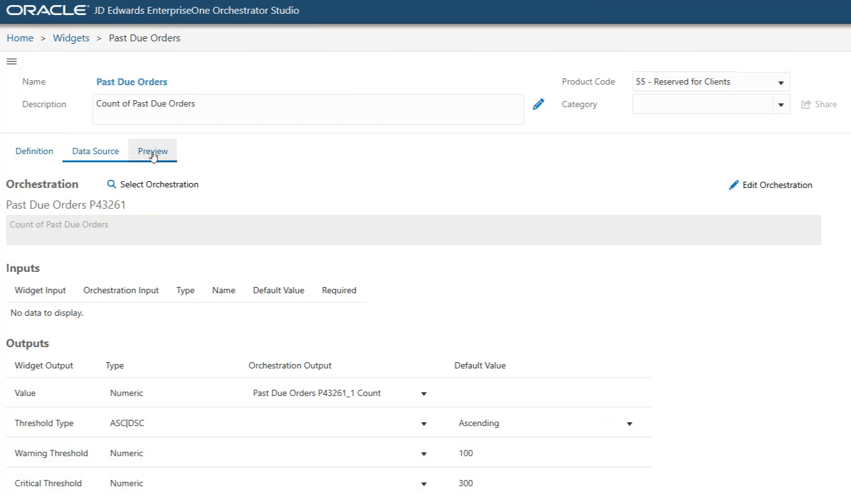
If there are 101 past-due orders, for example, simply seeing that number could be enough to tell someone that the situation needs attention. Thresholds can also be set, so a value moves into a warning or critical state when it reaches a certain point.
Other questions require more context.
Instead of asking only, “How many purchase orders do we have?” You may want to understand how those purchase orders are distributed across different business units.
Because the orchestration behind a widget can perform calculations and aggregate information, a widget can present more than a basic record count.
That's an important difference from a standard watchlist.
The value isn't simply having more data on the screen. It's being able to turn that data into information a user can understand more quickly.
Turn Data into an At-a-Glance View
Not everyone wants to look through rows of data to understand what is happening. Sometimes a visual is simply easier to process.
JD Edwards supports four main widget types: badges, meters, charts, and text boxes.
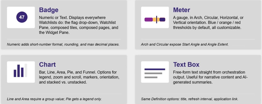
A badge works well when the number itself tells the story. A meter can help show where a value sits in relation to different thresholds. A chart can make it easier to compare information visually. A text box provides space for narrative information rather than only a number or graphic.
There isn't one “best” widget type. Each has its own purpose. The real question is what the person viewing the dashboard needs to understand.
For example, a chart showing purchase orders by business unit can make it easier to identify where the largest values are without asking the user to compare the underlying numbers individually.
That's where widgets can improve the JD Edwards user experience: they can reduce the amount of work required to understand what the data is telling you.
Bring JD Edwards and Outside Data Together
The information you need to make a decision may not all live inside JD Edwards.
If an outside source makes its data available through an API and an orchestration can retrieve it, that information can be presented alongside JD Edwards data. For example, external weather data can be brought into the same dashboard as JD Edwards information.
The weather itself isn't the important part.
The bigger takeaway is that a JD Edwards dashboard does not necessarily have to be limited to JD Edwards data.
If users regularly need information from another source to understand what's happening, bringing that information into the same view could reduce the need to move between systems just to get the complete picture.
The orchestration handles retrieving that outside information, while the widget gives users a way to see the result alongside the other information they monitor.
Show Users the Information That Matters to Them
A useful dashboard shouldn't necessarily show every user the same thing.
One person may care about a particular business unit, while another needs information from somewhere else in the organization.
Existing JD Edwards security still applies to the information behind widgets.
Widgets can also support more dynamic scenarios. The orchestration behind a widget can use variables at runtime, allowing the information returned to change depending on how the orchestration has been designed.
That doesn't mean a widget automatically knows what each person wants to see. If the information needs to change based on the user or another variable, that requirement must be accounted for in the design.
For organizations considering a more personalized JD Edwards dashboard, the important question becomes: What information does this user need, and what should determine what they see?
Keep an Eye on Changing Information
Operational information doesn't stay the same throughout the day.
Widgets can automatically refresh their data at a set interval. When it is time to refresh, the widget triggers its underlying orchestration to run and retrieve updated information.
Users can also manually refresh their widgets if they need updated information before the next scheduled refresh.
However, faster isn't automatically better.
A resource-intensive process running every five minutes can create unnecessary system activity simply because a frequent refresh interval is available. Widgets and their underlying processes should be designed as efficiently as possible.
So rather than asking, “How often can we refresh this?”, a more useful question is:
“How often does someone actually need this information to change?”
A metric used to make frequent operational decisions may require regular updates. Other information may be perfectly useful with a longer refresh interval.
The goal is current information—not unnecessary activity.
What Can’t JD Edwards Widgets Do?
JD Edwards widgets can make important information easier to see, but they aren't designed to replace every reporting or dashboarding tool. There are a couple of limitations worth understanding when deciding what role widgets should play in your JD Edwards user experience.
Don’t Expect a Full BI Drill-Down Experience
Seeing a chart naturally leads to another question:
Can I click it and see all the records behind that number?
Users should be careful about assuming a JD Edwards widget provides the same drill-down experience they might expect from a traditional business intelligence report.
An application call can provide a way to navigate from a widget into an application. However, based on the functionality discussed, users should not assume they can click a specific value and immediately drill into the exact records that produced it.
That distinction helps clarify the role of the widget.
A widget can tell you that something deserves your attention without necessarily being the place where you perform the deeper investigation.
Think of it as a way to surface a signal rather than a replacement for every detailed report.
You Can’t Switch Widget Types After Creation
There is also a smaller but practical limitation to know.
When a widget is created, its type is selected at the beginning. If you create a badge and later decide the information would work better as a meter, you can't simply change the existing badge into a meter. The widget would need to be recreated using the new type.
That makes it worthwhile to think about how users will consume the information before choosing the format.
Do they need a number? A warning indicator? A comparison? A visual representation?
Answering that question first can help avoid rebuilding the widget later.
Where Do JD Edwards Widgets Make the Most Sense?
JD Edwards widgets are most useful when people need a quick way to understand information they regularly monitor.
Potential dashboard uses include information for executives and users working with financials, distribution, inventory, logistics, and procurement. One example is monitoring critical inventory items so users can recognize when levels fall below a certain point.
Although the information differs, those examples share a common theme:
Someone needs to know what's happening without searching for it.
That's a useful test for determining whether information belongs on a widget.
If someone regularly needs to know a number, condition, trend, or status before deciding what to do next, making that information visible on a JD Edwards dashboard can shorten the distance between finding information and acting on it.
A widget doesn't need to show everything.
It needs to show what matters.
Final Thoughts: Making JD Edwards Data Easier to Use
JD Edwards widgets aren't simply about making JD Edwards look more visual. Their real value is making important information easier for users to find, understand, and monitor.
They can go beyond simple counts, present information visually, incorporate outside data, account for different user needs, and keep operational information current. But they also have boundaries. The widget depends heavily on the orchestration behind it, and it shouldn't automatically be viewed as a replacement for detailed reporting or business intelligence tools.

The best place to start is with the user and the information they need. From there, the right orchestration and widget can turn that information into a view that is actually useful.
ERP Suites can help identify where JD Edwards widgets can improve the user experience, then build the orchestrations and widgets needed to bring those operational insights into a more accessible dashboard experience.

.png?width=650&height=325&name=Blog%20Images%202_1%20(2).png)
.png?width=650&height=325&name=Blog%20Images%202_1%20(1).png)
.png?width=960&height=540&name=Blog%20Images%20(98).png)
.png?width=960&height=540&name=Blog%20Images%20(88).png)
.png?width=960&height=540&name=Blog%20Images%20(86).png)
.png?width=960&height=540&name=Blog%20Images%20(85).png)
.png?width=960&height=540&name=Blog%20Images%20(83).png)
.png?width=960&height=540&name=Blog%20Images%20(75).png)
.png?width=960&height=540&name=Blog%20Images%20(71).png)
.png?width=960&height=540&name=Blog%20Images%20(3).png)